Drupal 10: Responsive Images for Different Screen Sizes
Drupal 10 includes the Responsive Image module, which allows you to control the size of images displayed on different screen sizes, such as mobile phones, tablets, and desktops.
Configuring the Responsive Image Module
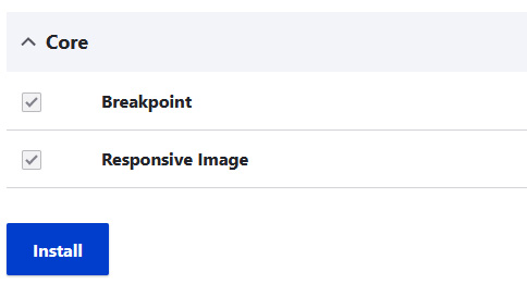
1. Enable/Install the Module:
In the Extend page, locate the Responsive Image module and enable or install it.
2. Create a Responsive Image Style
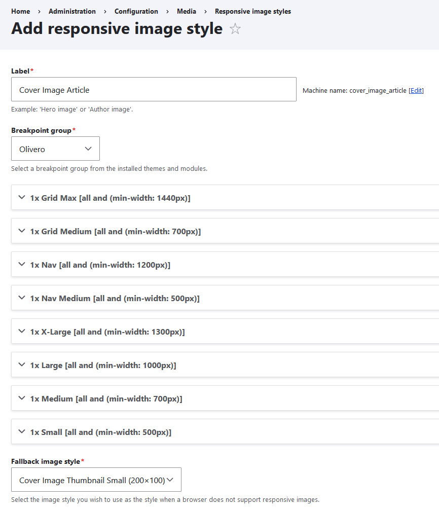
Navigate to Configuration > Media > Responsive Image Styles.
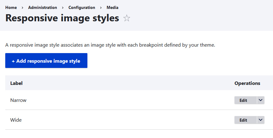
- Click Add responsive image style and provide a name (e.g., Cover Image Article).
- Breakpoint Group: Select a breakpoint group from your theme or create a custom one (see link for details: Working with breakpoints in Drupal).
- Theme: Assuming you're using the Olivero theme, it provides 8 breakpoints. Choose the 4 you need for this style: Small, Medium, Large, and X-Large.
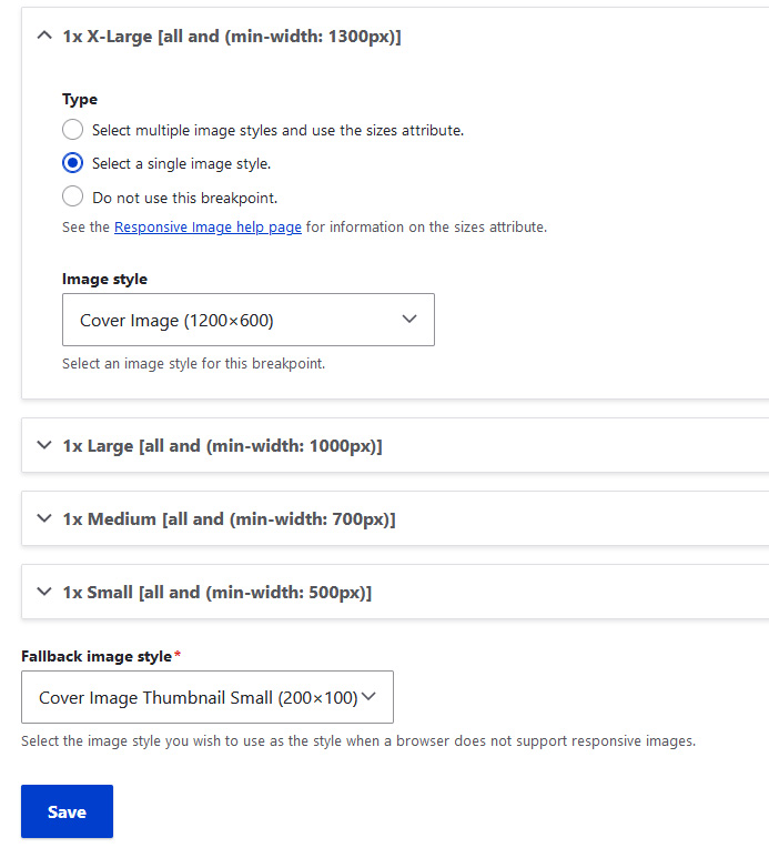
- Image Style Selection: Choose Select a single image style.
- Image Style per Breakpoint: Select the appropriate image style for each breakpoint.
- Fallback Image Style: Specify a smaller style to use as a fallback if the above conditions are not met.
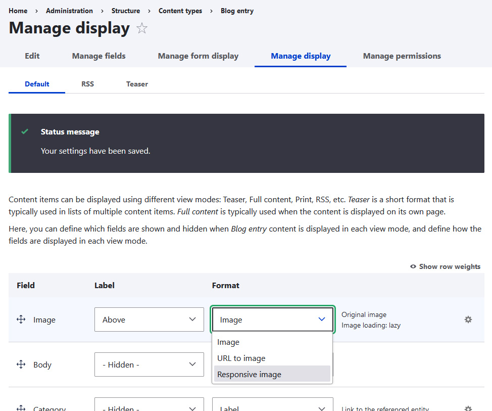
3. Apply the Responsive Image Style to Content
- Go to Content types and open the Manage display settings for your desired content type.
- Change the image field's format to Responsive image.
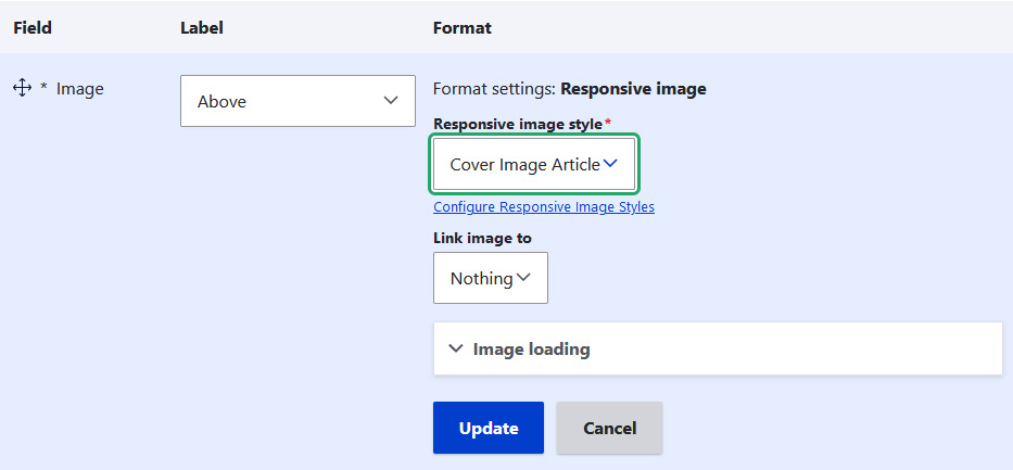
- Select the Responsive image style you created (e.g., Cover Image Article) and click Update to save the changes.